New Ship Designs
Over the past month or so, I've been putting a lot more time into play testing Star Commander. I feel almost too close to it as a personal project to know its quality at this point, and it's been really good to get other people's viewpoints and opinions. Feedback has been very positive so far; people are enjoying playing the game, and they want to play it again. There are still some issues that need to be worked out, like how a game ends, but so far it seems players like the core of the game, and that's great!
During my last playtest, one of the clearest pieces of feedback was that ship and station design from the current prototype are not clear.
- First, all cards regardless of domain have the same design in the background (a star, colored to match the domain).
- Second, attack and hit points are in the top right corner next to cost. While there is some coloring difference between the stats, there is no differentiator between stats beyond that.
- Third, it became very clear in this playtest that ship speed is a stat that should be tracked. Prior to the latest changes, the rulebook stated that all ships except fighters could move once per turn, with other cards (like Enhanced Jump Drive) adding additional movements. This led to a confusing interaction with fighters, because fighters can't jump, but getting an additional jump meant that fighters can now jump. Adding a speed stat to each ship means that fighters can have a movement of 0, and Enhanced Jump Drive adds +1 speed to each ship.
Based on this, along with other feedback and observations, ships and stations have been redesigned visually. It's also worth noting that the current prototype's designs were originally made back in 2010, and were repurposed for the latest version of the game. The cards definitely needed a refreshed look, considering the rules changes that have taken place since then.
Without further ado, here's the new ship designs!
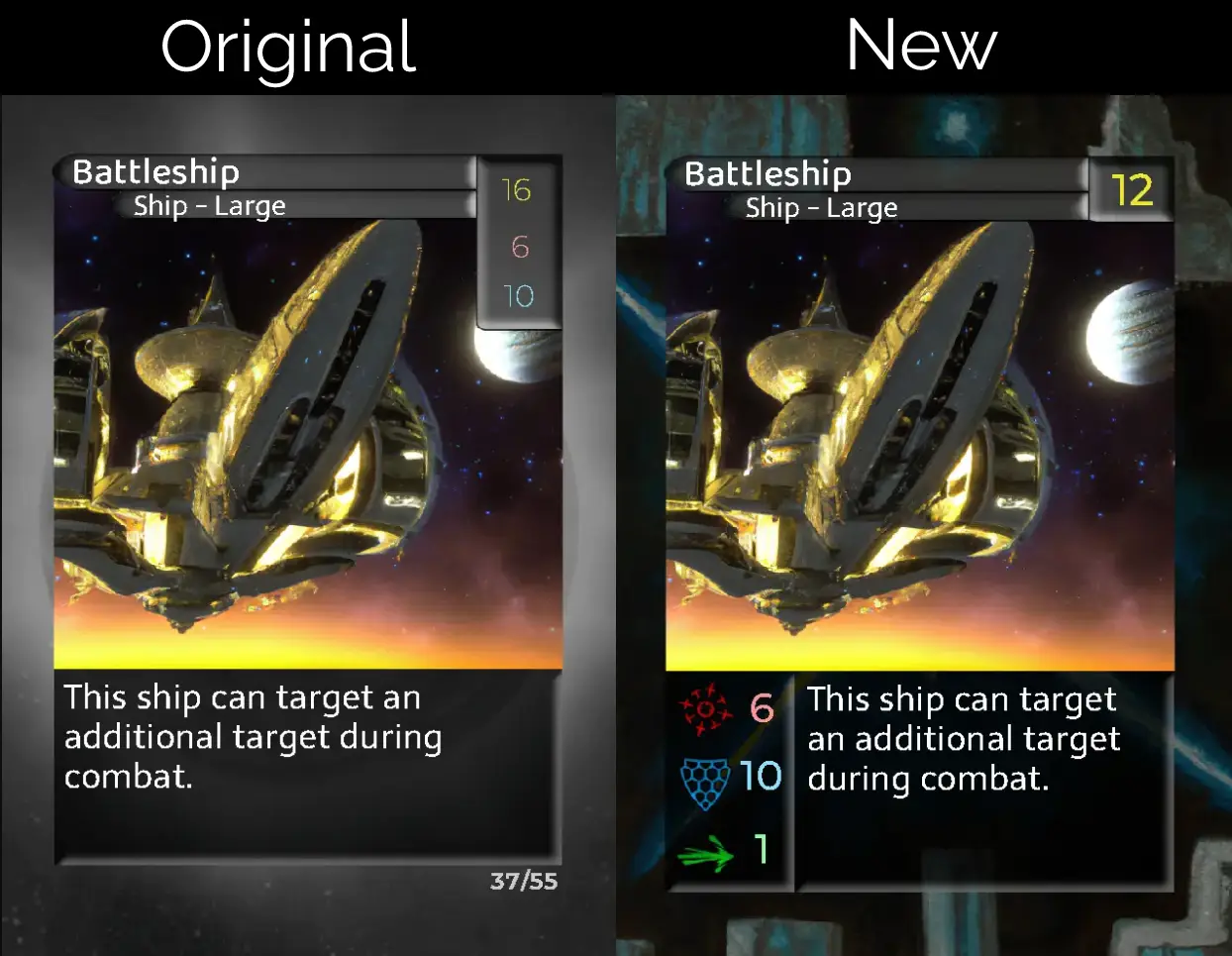
Ship stats are now in the bottom left of the card, and rules text has been shifted to the right. Each number is also significantly bolder, making values more visible, and symbols have been placed next to stats in order to help differentiate them in another way than color.
This layout change has been a long time coming. Since I wasn't planning on printing new prototype cards any time soon, I didn't want to make any structural changes to the cards until I was feeling good about the state of the game. After the recent playtests, however, I am feeling quite good about the state of the game. It's not ready for a full reprint yet (too many cards are still being tweaked after each play), but it's getting a lot closer.
On an interesting note, I found an old design from when I first started mocking out the game that somewhat resembles the new card design. I cannot tell you what all of the numbers or rules text mean any more, but it's interesting as a standalone piece of history.
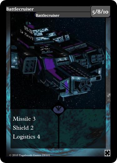
The early game took a lot of inspiration from Sins of a Solar Empire.
All cards have been similarly touched up with new backgrounds, and a reduced (or removed) cost box in the top right corner. Check out the Card Database to see all of the updated designs!